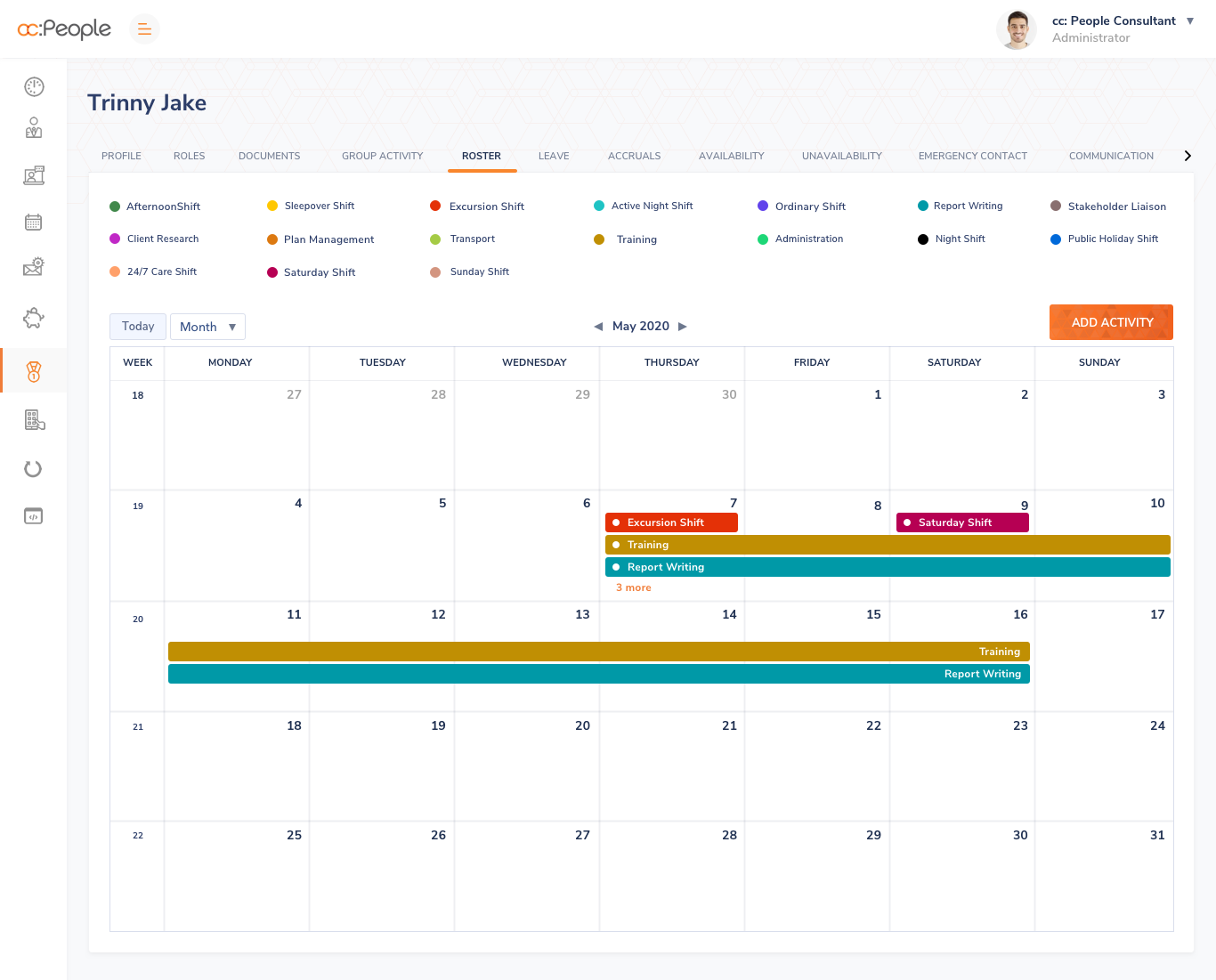
The demand for care services within our community is critical. Short of cloning more amazing humans to provide care, a key way to meet demand is to increase efficiencies and support for both the caregivers and the care recipients – and that means access to innovative technology. Platform for Care has developed 5 software solutions for service providers delivering care in our communities in a range of sectors, outside of hospitals. These online solutions are built to scale and provide the features and benefits that essential service providers require to do their everyday inspiring work. Our world class solutions deliver functional support from staff rostering and billing, to NDIS funding management, and advanced monitoring for essential workers and patients to keep them safe. The services are delivered in a patient centric environment, enhancing the patient experience, whilst offering a cost effective solution for all stakeholders responsible for patient care. With more than 100 years of experience delivering complex health systems across the continuum of care, Platform for Care provides critical solutions that are second to none, and importantly, always keeps the patient-carer relationship at the heart of what we do.
- How much time do you use the application on daily basis ?
- After login into the application which page is mostly used by the users for their daily work ?
- How is the navigations in this application ?
- How about the colors used ?
- How about the Typography, icons images, did they are easily relatable ?
Use cases
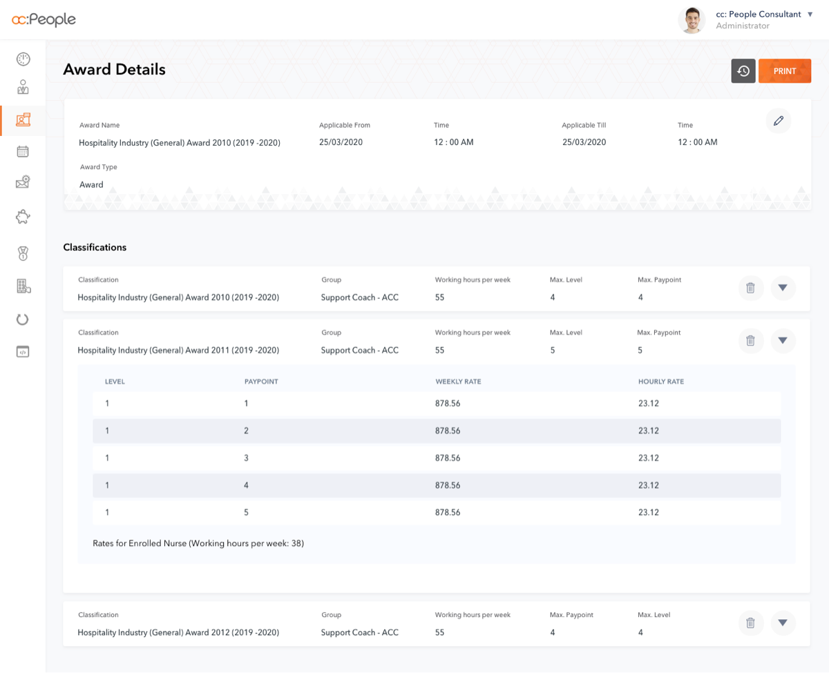
- Client need a clean user interface with minimal colors
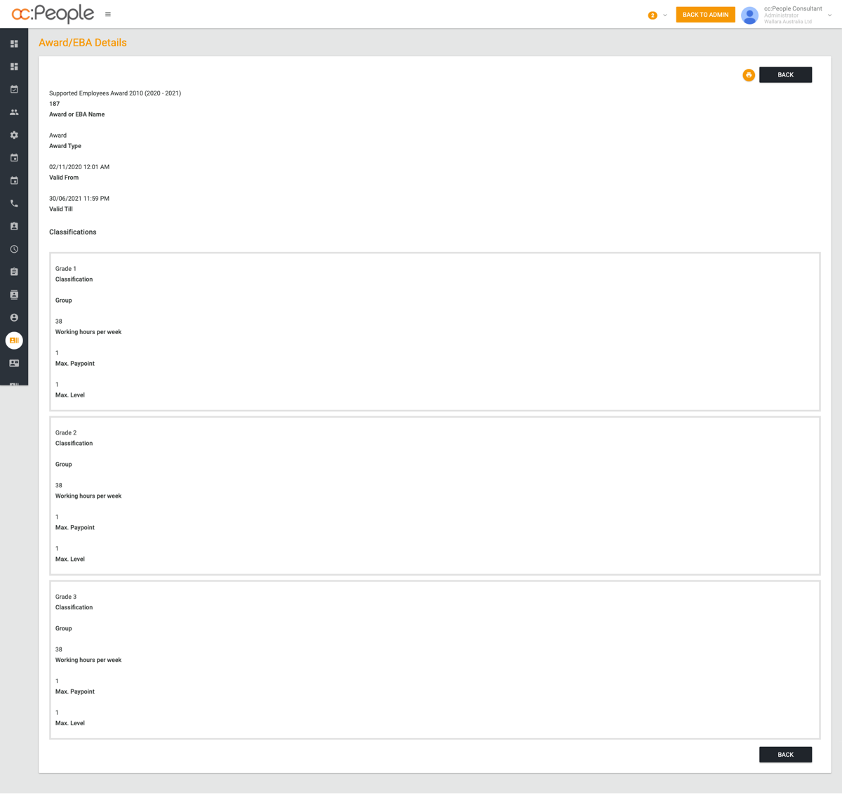
- Due to more and more navigations and actions in every page user gets confused on what to do next and where to click
- Users should feel more comfortable and are able to get things done more quickly rather than spending much time on understanding the interface
- User may not have expert knowledge on saas applications, so icons, images, texts should reletable.
Focused On
- Client informed us to go with minimal colors
- Relevant icons
- Simple navigation
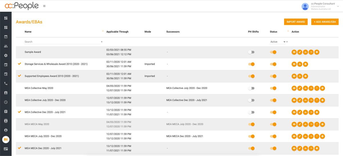
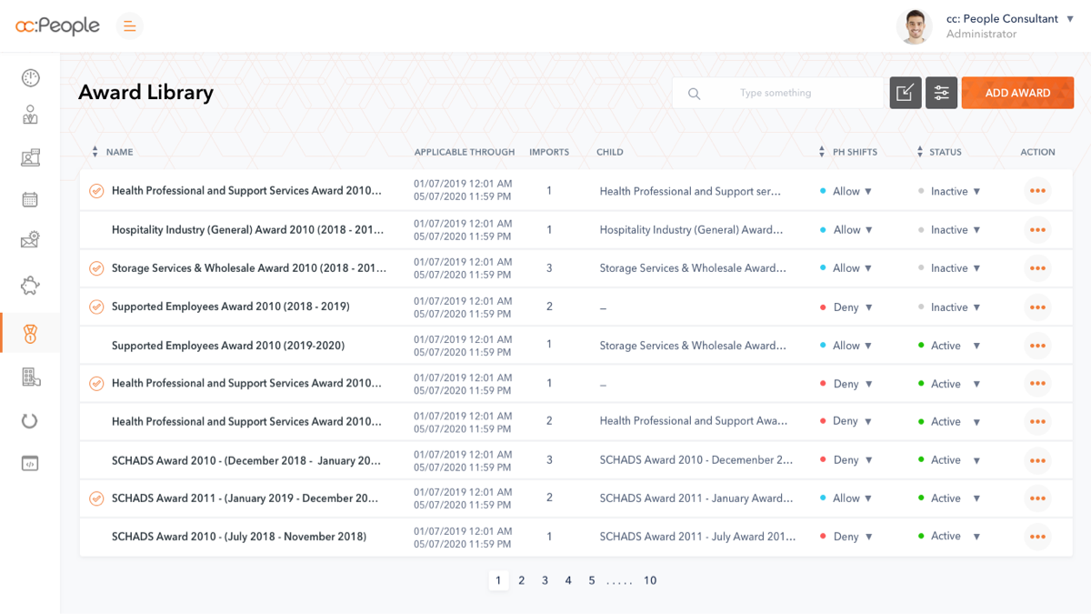
- In the table listing pages there are are more than 3 actions are there so grouped and listed the actions as more options also the space can be utilised for contents.
- Given importants to the primary and secondary actions.
- In table listing given more importants to the more important column by hightlight it with color daker than the secondary important texts
- Replacing negative space with patterns
